And guess what? I actually have a finish this week! :) Wohoo!
Over the weekend, I spent every free moment doing something quilty. Whether it was checking for updates from Spring Quilt Market (religiously) or actually getting in some sewing time, I loved every minute of it!
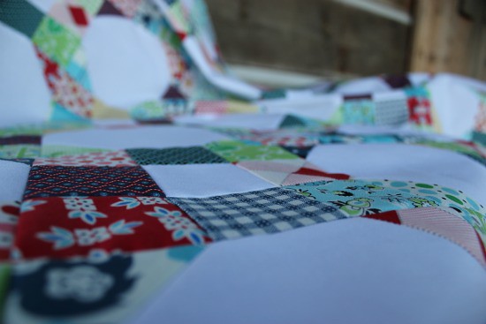
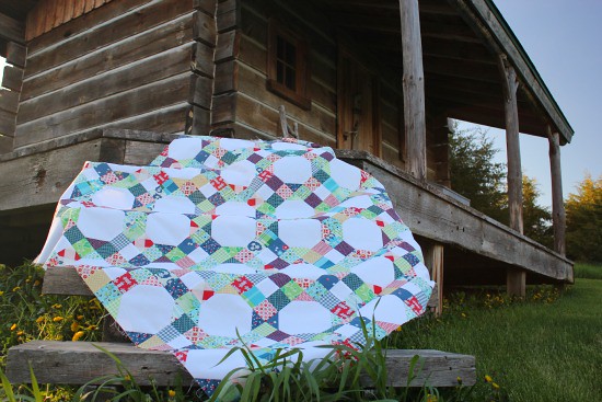
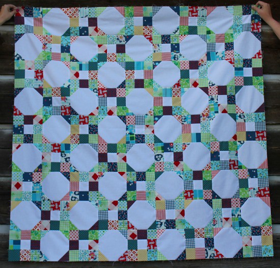
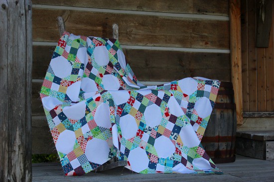
Lately, I have felt my sewing mojo has been running dry. So this weekend I decided to start something completely new with my Denyse Schmidt Fairgrounds and Picnic fabric. It was such a great feeling to put something up on my design wall on a Saturday and finish on a Sunday.
The pattern is from the American Patchwork and Quilting Spring 2011 Top Ten Quilt Store magazine. I love the simplicity of the two quilt blocks and how they interact together in the quilt.
Now, there seems to be much debate over the new line and how the colors look together. To each his (or her) own, but I LOVE them!
The only thing left to do is quilt this little, measuring 54" x 54", beauty. Any suggestions?
Now it's your turn to link up a recent modern sewing finish. If you need a refreasher, you can find the rules over here. Just be sure to add a {Sew} Modern Monday link and/or the button somewhere in your post. Please and Thank You! :)




The quilt top looks wonderful. Very fresh.
ReplyDeleteYour pictures look great. I can't take a decent quilt picture. They just lay there and look flat.
Yeay! Love to see those DS prints in a quilt top--it gives me some ideas for what I should do with mine. :)
ReplyDeleteOh this just screams picnics and summer to me! I personally love the line and think the fabrics work great together. That pattern is so fun! Great finish
ReplyDeleteIt's really pretty, Megan!
ReplyDeleteAnd beautiful photos, too!
This is beautiful! I love the quilt pattern with these fabrics.
ReplyDeleteOh my gosh, I saw a snippet of this and didn't know you were done with the quilt top already! It looks fabulous...the white really looks great with the DS fabrics. I think all of them look fantastic together!
ReplyDeleteLoooove the quilt top - the combination of those lovely classic blocks is fabulous! For quilting, I would do a line of diagonal quilting through the middle of each 9-patch, going in both directions so it would make an X. Then I would do a flowery thing in each snowball.
ReplyDeleteOh it's really lovely Megan!! Love how the colours work together.
ReplyDeleteI love the color combination!! Just darling!!!
ReplyDeleteI linked up a simple appliqued pillow, hope that's OK with the rules:)
ReplyDeleteI'm with Felicity, I think that quilting diagonally would be lovely, with some kind of free-motioned design in the snowballs would be awesome. It's funny, I've never really loved snowball quilts before...but I love this one!! This quilt top is just lovely!! I adore it, can't wait to see it all finished up!
ReplyDeleteMegan, Your quilt top looks great and I think all the fabrics work together really nicely. Great photos and photo shoot location too. Thanks again for hosting the linky. I'll be back later to surf the list. Happy Monday!!
ReplyDeleteI think this is fantastic! The prints look amazing together. Great work!
ReplyDeleteLove your quilt! It reminds me of a woven wicker seat to an old wooden chair. And the backdrop! You have quite the setup.
ReplyDeleteI love this design and looks great in the new DS (which I happen to love too). Perfect!
ReplyDeleteGreat design for the DS fabric! Really stands out.
ReplyDeleteI love your quilt! I am trying to find the issue of the magazine online - does it have a red,white and blue quilt on the cover and says Ultimate Shop Hop with the ten crossed out and the number 11 added in?
ReplyDeleteWhen I saw that pattern in the magazine I thought it was ok, but yours looks amazing. I like how you didn't add the rick rack and yo-yos. So much better!
ReplyDelete