sometimes i just can't resist temptation. especially when it comes to quilt alongs. there's just something so enticing about sewing along with lots of other fabric addicts like myself. am i wrong? well this time it's the Swoon-Along hosted by Katy of I'm a Ginger Monkey. but being that i had already picked up the Swoon pattern by Camille Roskelley when i was in Salt Lake City for Sewing Summit last fall and the fact i just happened to have a FQ bundle of Outfoxed by Lizzy House just laying around from Pink Castle Fabrics, it was practically meant to be. right? right.
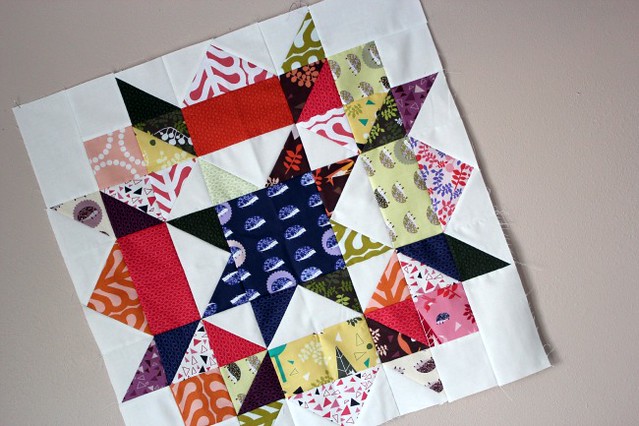
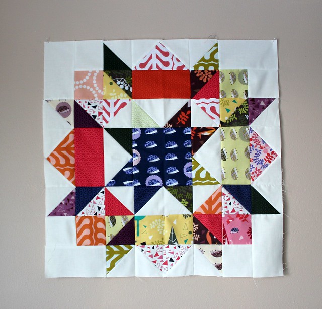
last weekend i set out to make one block -- just to test the waters. after seeing erin's KJR block i knew i wanted to take the scrappy road with this quilt. so i jumped in, head first, and when i was done i had one terrible quilt block. so terrible, i didn't even want to take pictures...sorry about that. take my word for it, it was like a terrible episode of "scrappy gone wild" was sitting right in front of me and i didn't know what to do. even the boyfriend so kindly advised that "there's just too much going on." so i ripped it apart and let it sit for a few days.
then i had the idea to separate my Outfoxed into "warm" and "cool" colors. that way i could keep the scrappy look, but still maintain the look of the original Swoon block. make sense?
now here's where you come in. tell me, do you like it? keep going? send those hedgehogs and fox to the curb? honestly, i'm looking for some good healthy suggestions. i personally like it. sort of. blurg. i really don't know. sometimes i look at it and think "yeah! keep going!" and then a few minutes later i change my mind. help!
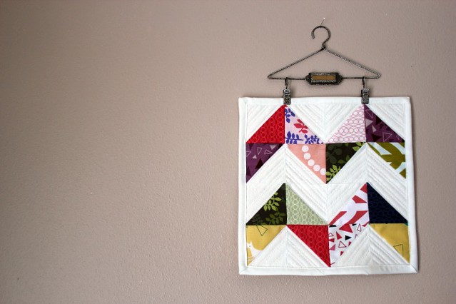
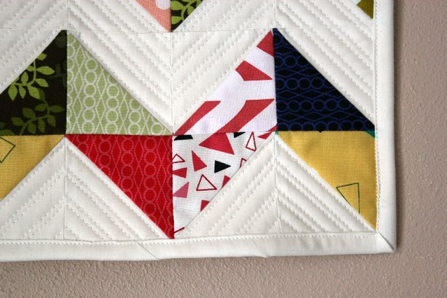
oh, and while i've been stuck in limbo all week about this block i made a little mini quilt (finished size 8"x 8") using the left over HSTs. i'm sending it off to my little sister at college. hopefully it will bring some quilty cheer to her dorm room!
there you have it. my swoon dilemma. i'll just be sitting here, anxiously awaiting your advice+suggestions. thanks in advance! :)
xo, megan.


I love the BOLDNESS of it!!!! I think it is fabulous!!!!!
ReplyDeleteI love the scrappiness. I think my only suggestion/idea would be to limit the fabrics with the white backgrounds because they seem to be blending into your white background. Can't wait to see more!
ReplyDeleteI'm sorry but I have to side with the boy on this one. :) I'm also one to really care about directional fabric, so the way hedgehogs end up pointing lots of different directions in the block doesn't gel for me. I love the little mini quilt, though, and think that's a great pattern for this fabric line!
ReplyDeleteI think it's too busy, unfortunately. What if you just did scrappy for the star and it's radiating points, and then used one of the calmer prints, like the jewels or the bracelets for the "flower" part? Or kept the scrappy but grouped more by color than just warm and cool. So the star and radiating points could be the purple prints, and then the flower part could be the orange prints...something like that. Just to give it a little bit of cohesion so that the pattern isn't lost while your eye is trying to rest.
ReplyDeleteBut I love Outfoxed and think this has great potential! :)
I am one to be annoyed by things going the "wrong" way. I do however love the scrappiness of the block.
ReplyDeleteI LOVE how scrappy and boldly crazy it is... keep going. Sometimes it's good to be a wee bit out of your comfort zone!
ReplyDeleteI really love it Megan! I'm going scrappy too, and I've had my doubts along the way but after I finished a full block I'm liking it much better. I say go for it!
ReplyDeleteI love scrappy too. But I agree with Faith about the white background fabric maybe blending a little too much. The little quilt is adorable!!
ReplyDeleteI LOVE it!! Keep going! :)
ReplyDeleteLove it, keep going! I agree with Faith though, perhaps ditch a few of the white background prints, I think that would definitely help the design read cleaner :)
ReplyDeleteYum, yum, yum!
I think when you've got 9 of those bad boys together in a quilt its going to be rad. ;] But this is advice from someone who loves her Terrifyingly Awesome scrappy quilt tons!
ReplyDeleteI would side with the boyfriend on the Swoon block, but have to say I love your mini quilt and the quilting on it.
ReplyDeleteI think it's cool. The directional thing doesn't bother me...unless it's a wall quilt, how often do you look at it vertically, you know? I agree with Faith and Jeni--the top left point of the center star gets a little lost to me. But I think it's fun!
ReplyDeleteLOVE it!! Please keep going!!!
ReplyDeleteI say embrace it!!! It looks just like the color wheel, how neat!
ReplyDeleteI love it Megan, I'm totally digging the scrappiness, and I think when you have an entire quilt of it, the scrappyness will almost be cohesive...if that makes sense, haha. After seeing all the crazy awesome scrappy swoons, I now have a scrappy swoon on my to do list also!
ReplyDeleteI like it. It's totally different from all the swoon blocks out there. And there may be a few too many at the moment - lol! It changes the design elements of the block and is really fun and interesting to look at.
ReplyDeleteI love the Swoon block and the mini quilt. Both are fun and interesting. Keep on going.
ReplyDeleteI think there needs to be a little more value attention. I love the scrapiness and I love the block but what isn't working is the geometry in the eye. There are too many light and dark prints on white. Maybe if you had light prints on white mixed with other white prints on white for the center star and bold prints for the outer and mixed it that way. That would give each block a different feel depending on what you did with the values for that block one being white prints/bold, one cool solid-ish/ warm solid-ish... etc Hopefully this comment made sense there is a swoon quilt that i love the color play but I didnt favorite it and I don't have the time to look for right now but they used this concept well.
ReplyDeleteIt's too busy for me, so I'm on the boy's side (I don't like the KJR version either). However, I do love the mini quilt.
ReplyDeletelove love love the scrappy look with the dark scraps. The lighter scraps get lost. Keep it going, it looks fabulous!!! Love the scrappy look of the mini quilt too
ReplyDeleteToo busy IMHO. I love outfoxed and I think it's getting lost in the swoon block.
ReplyDeletelove the block. what if you sashed the blocks together with one of the darker fabrics? I think it'd be really cool.
ReplyDeleteI like it, but... My suggestion would be to take a picture of it in black and white and maybe focus a little more on the values (is that the right word? It's late and i'm tired.) :) I think that's one thing i've noticed with other swoon blocks I'd the design is defined more by value. Of course I think you could definitely go against that and be successful. :) I'd say leave it, but play around some more with your next block, and each block after. It would be awesome to have a scrappy quilt where each block has some kind of different emphasis to it. :)
ReplyDeleteI think it looks great! Are you going to alternate the position of the warm and cool and alternate the layout? Does that make sense??? So the top row might be cool centre, then warm centre, then cool centre?
ReplyDeletevery sweet mini quilt
ReplyDeleteI'm not really a huge fan, actually. Sorry! I think scrappy blocks look better if they are based on color (all blue scraps for one part and all green scraps for another, etc. etc.) OR, like a few other commentors have suggested - work it more on values of fabrics than on 'cool' vs 'warm.' I think the cool/warm gets a little lost in this busy of a pattern but really true light/dark might totally make it work! Good luck with it! Definitely don't give up because I think it could look really neat!
ReplyDeleteErm, not loving this so much, sorry! The colour balance seems a little off somehow, however I seem to be in the minority so just ignore me ;o)
ReplyDeleteLove this line! I have all the hedgies and the peach and purples. If you have all the fat quarters why not pick the colors that complement each other. Blue/green... purple peach and so on and mix within the color groupings. I didn't like Hope Valley until I saw Lee's gradation of colors on her supernova. Then I loved it. Do what *you* love. :)
ReplyDeleteThe basic elements of the block are not coming through. I think one of the reasons that the KJR block works is that the overall palette and size of the designs lends itself to being cut small. I'm not sure that outfoxed does. The lighter backgrounds against white are being blended in. And the darks are not arranged in a way to bring out the geometric elements of swoon. Scrappy can definitely work - but not if you do it without a plan, you know? However - you are a fantastic piecer, great workmanship!!! Whatever you make is going to be fabulous - what do we know, anyway?
ReplyDeleteI think it's a little crazy for my taste but I'm with Faith, if you took out the ones with the white backgrounds (or only used them for the star centers), that would help the cohesiveness a lot. Good luck! It's fun seeing all the different interpretations of this quilt.
ReplyDeletehere's my 2 cents: I would replace the lighter fabrics (the pink triangles, the hedgehogs, and the yellowish trees ones) with something darker and try to stick with more tone-on-tone scraps than ones with lots of contrast in them. I would also eliminate the pink/white and the sage-y green/white fabrics--its not that they are large scale prints, its because of too much contrast in them. especially when you are using white as your negative space. the pink/orange pieces are fine to me. anywhoo, that just my little opinion :) I'm sure your finished project will turn out awesome, just like they always do!
ReplyDeletei really like it actually. but i would keep these scrappy blocks as one, two or three of the overall and make the others out of single colors. make sense? that way you have these wicked cool scraptastic blocks but they are the interesting exception and not the whole quilt.
ReplyDeleteThe mini quilt is so cute! I would love to have my sister send me one for my wall :) Where did you find the cute little hanger that it's on?
ReplyDelete